TYPE TESTER
FEATURES
ABOUT
Hawkes is an extensive handmade typeface family that comes with a bundle of weights, widths and styles, all designed to work cohesively.
INSPIRATION
I love creating organic typefaces that offer a handmade element to them. Offering fonts with loads of extras and features allows users to really tailor the type to their needs. While this means a little extra learning up front, once you learn the Opentype feautres of a font, it really opens up a new world of typography, even when it’s a hand-written style!
While I have experimented a lot with different weights, (light, regular and bold being the standard) I wanted to also expand into the width axis as well, creating narrow, regular and wide font styles. Each weight and width of Hawkes has its own subtle personality, while maintaining a base structure that is present throughout. For example, in thinner weights, I kept rounded characters more square in their curves. As the typeface expands in width, the rigidity of the curves gave the typeface too much of a stiff aesthetic. So I began rounding the curves more as the characters got wider. The unintended affect was offering each weight and width its own style, which works well in a handmade typeface family.
The script was inspired by a friend from design school who creates adorable paintings and simple lettering. I love her style and the simple style of her script lettering in particular. But for script lettering styles to be translated to type, it can get fairly complicated. First, the connections need to be seamless even when there is no identical pattern. To make things more complicated, to truly create authentic handmade typfaces, you need to design multiple versions of each character. For a script font, it means not only perfecting the combination of 26 letters, but 78 (or more if you are including connecting Capitals.) Additionally, connecting stroked (between to characters in the middle of a word) will have a different stroke than when a character is placed either at the start of the word, the end of the word, or when it’s isolated. So each character has three variations of each medial (middle) glyph, but also an initial, final and iso form as well. Not only is it difficult to design all these characters in a natural way, but getting the coding to properly place the right version of the character, is tricky. All of this happens without the user of the font knowing it, allowing them to use the font without worry or extra fuss. At the end of the day, creating a simple and cute script font ends up being the most work of all! Not to mention when you add swashes, titling characters and other features. Keeping track of all the backend work is headache inducing.
Hawkes Sans The primary subfamily is a sans-serif typeface that includes six fonts: three weights (light, medium and bold) and three widths (narrow, regular and wide). Within this set are an array of stylistic features; including small capitals, character style alternatives, discretionary ligatures and contextual alternatives. See details below for more information on OpenType Features. Hawkes Variable Width Sans The secondary subfamily is the same base sans-serif fonts but combined in variating widths. Essentially, it takes all three widths of each weight and randomly mixes them together. This creates a funky and creative alternative to the more traditional sans-serif set. The variations are for the uppercase, lowercase, small capitals, ligatures and numbers.
Hawkes Script The last subfamily is the script typeface. It’s a quirky script with variations of its own, including ligatures, swashes and contextual alternatives (again, see below for further details.) The script font works great as a complimentary style to the sans-serif, or on it’s own.
FEATURES
Alright, let’s get into all the extra goodies this typeface has to offer.
Small Capitals Small caps are short capital letters designed to blend with lowercase text. These aren’t just capital letters just scaled down but designed to fit with the weight of both the lowercase and capitals. With Hawkes, small caps can either sit on the baseline (in line with the base of the capital and lowercase) or to be lifted to match the height of the capital letters by applying the discretionary ligature setting in the OpenType panel. These small capitals have a dot underlining them that sit along the baseline. The feature offers a unique display affect that is great for logos, titles and other headline needs.
Discretionary Ligatures A discretionary ligature is more decorative and unique combination than a standard ligature and can be applied at the users discretion (as the name indicates.) The specific styling for these ligatures varies for different fonts. With Hawkes, they are used as an all capital styling feature, or to lift the small capitals to align with the height of the capitals. In the former setting, both lowercase and uppercase letters are first changed to all capitals, then a specialized set of letter combinations are transitioned so small characters are positioned within a main capital letter. These combinations only happen with main characters that include an applicable stem, such as C F K L R T Y. Some of these combinations include two or three characters. When Small Caps is turned ‘on’, this feature will lift the small caps to the height of the capital letter. For more information, please check out the user guide!
Stylistic Alternatives Stylistic alternates are a secondary form of a character, often used to enhance the look or style of a font. For Hawkes, these alternatives provide a slightly more handmade feel.
Hawkes is an extensive handmade typeface family that comes with a bundle of weights, widths and styles, all designed to work cohesively.
INSPIRATION
ABOUT
I love creating organic typefaces that offer a handmade element to them. Offering fonts with loads of extras and features allows users to really tailor the type to their needs. While this means a little extra learning up front, once you learn the Opentype feautres of a font, it really opens up a new world of typography, even when it’s a hand-written style!
While I have experimented a lot with different weights, (light, regular and bold being the standard) I wanted to also expand into the width axis as well, creating narrow, regular and wide font styles. Each weight and width of Hawkes has its own subtle personality, while maintaining a base structure that is present throughout. For example, in thinner weights, I kept rounded characters more square in their curves. As the typeface expands in width, the rigidity of the curves gave the typeface too much of a stiff aesthetic. So I began rounding the curves more as the characters got wider. The unintended affect was offering each weight and width its own style, which works well in a handmade typeface family.
The script was inspired by a friend from design school who creates adorable paintings and simple lettering. I love her style and the simple style of her script lettering in particular. But for script lettering styles to be translated to type, it can get fairly complicated. First, the connections need to be seamless even when there is no identical pattern. To make things more complicated, to truly create authentic handmade typfaces, you need to design multiple versions of each character. For a script font, it means not only perfecting the combination of 26 letters, but 78 (or more if you are including connecting Capitals.) Additionally, connecting stroked (between to characters in the middle of a word) will have a different stroke than when a character is placed either at the start of the word, the end of the word, or when it’s isolated. So each character has three variations of each medial (middle) glyph, but also an initial, final and iso form as well. Not only is it difficult to design all these characters in a natural way, but getting the coding to properly place the right version of the character, is tricky. All of this happens without the user of the font knowing it, allowing them to use the font without worry or extra fuss. At the end of the day, creating a simple and cute script font ends up being the most work of all! Not to mention when you add swashes, titling characters and other features. Keeping track of all the backend work is headache inducing.
Hawkes Sans The primary subfamily is a sans-serif typeface that includes six fonts: three weights (light, medium and bold) and three widths (narrow, regular and wide). Within this set are an array of stylistic features; including small capitals, character style alternatives, discretionary ligatures and contextual alternatives. See details below for more information on OpenType Features. Hawkes Variable Width Sans The secondary subfamily is the same base sans-serif fonts but combined in variating widths. Essentially, it takes all three widths of each weight and randomly mixes them together. This creates a funky and creative alternative to the more traditional sans-serif set. The variations are for the uppercase, lowercase, small capitals, ligatures and numbers.
Hawkes Script The last subfamily is the script typeface. It’s a quirky script with variations of its own, including ligatures, swashes and contextual alternatives (again, see below for further details.) The script font works great as a complimentary style to the sans-serif, or on it’s own.
FEATURES
Alright, let’s get into all the extra goodies this typeface has to offer.
Small Capitals Small caps are short capital letters designed to blend with lowercase text. These aren’t just capital letters just scaled down but designed to fit with the weight of both the lowercase and capitals. With Hawkes, small caps can either sit on the baseline (in line with the base of the capital and lowercase) or to be lifted to match the height of the capital letters by applying the discretionary ligature setting in the OpenType panel. These small capitals have a dot underlining them that sit along the baseline. The feature offers a unique display affect that is great for logos, titles and other headline needs.
Discretionary Ligatures A discretionary ligature is more decorative and unique combination than a standard ligature and can be applied at the users discretion (as the name indicates.) The specific styling for these ligatures varies for different fonts. With Hawkes, they are used as an all capital styling feature, or to lift the small capitals to align with the height of the capitals. In the former setting, both lowercase and uppercase letters are first changed to all capitals, then a specialized set of letter combinations are transitioned so small characters are positioned within a main capital letter. These combinations only happen with main characters that include an applicable stem, such as C F K L R T Y. Some of these combinations include two or three characters. When Small Caps is turned ‘on’, this feature will lift the small caps to the height of the capital letter. For more information, please check out the user guide!
Stylistic Alternatives Stylistic alternates are a secondary form of a character, often used to enhance the look or style of a font. For Hawkes, these alternatives provide a slightly more handmade feel.
GLYPHS
LICENSING
Pairings
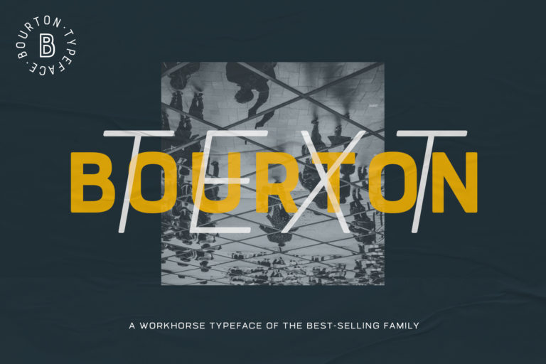
Bourton Text
Styles starting at $10
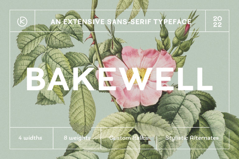
Bakewell
Styles starting at $10
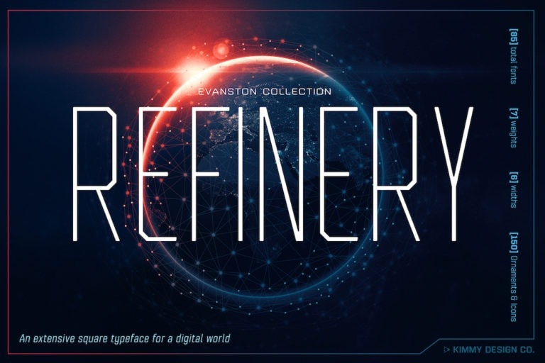
Refinery
Styles starting at $10