TYPE TESTER
FEATURES
ABOUT
Development
Madley began as an exploration of contrast from Winslow. Orginially entitled Winslow Slab, I took the skeleton and framework from Winslow and reduce the contrast down to nearly zero, and gave the bracketed serifs a rounded block (or slab, if you will) serif instead. This created an interesting variation to Winslow Book. Creating a mono linear serif typeface has many challenges, particularly in the heavier weights, so alterations were made to ensure stability of the new typeface.
When I began using Madley (then Winslow Slab) in mock-up text settings, I began to experiment with stylistic alternates, swashes and ligatures. It grew into a family of it’s own, and thus a rebranding felt necessary.
About
Madley is a contemporary slab serif typeface. Featuring monolinear stems, elongated block serifs and teardrop terminals, the type family goes from a delicate Hairline weight to a heavy Black weight. Because of its range in weights and extensive Opentype features, it’s a perfect font for both text and display text settings.
Alternative features include a wide array of swashes assigned up to 11 for select characters, combining ligatures in capital unicase settings, and stylistic alternates for some letters. To see more, please check out the User Guide and Specimen booklet.
The slab serif was first designed and used in the 19th century. As printing and advertising expanded in the early nineteenth century, new display typefaces were developed to grab attention. The first known example was seen on a lottery advertisements in London, as a wood block type by Vincent Figgens, named Antique.
Eventually the style was designated as Egyptian. Although the typeface had nothing to do with Egypt, it was named at a time when Egypt was discovered by Europe and became immensely popularized. So it’s named more after the fascination of Egypt during that time than anything particularly Egyptian.
The slab serif was then reworked into what became the more refined Clarendon typefaces, with bracketed serifs and had greater usage, with both text and display purposes. These types had very little to do with the original, blocky slabs. Their proportions were more defined, and their contrast was
Today, slab serifs as their own style have been refined to be different from their historical counterparts and the Clarendon style.
GLYPHS
LICENSING
Pairings
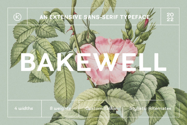
Bakewell
Styles starting at $10
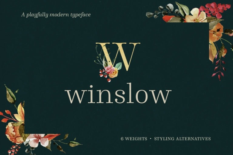
Winslow Book
Styles starting at $25
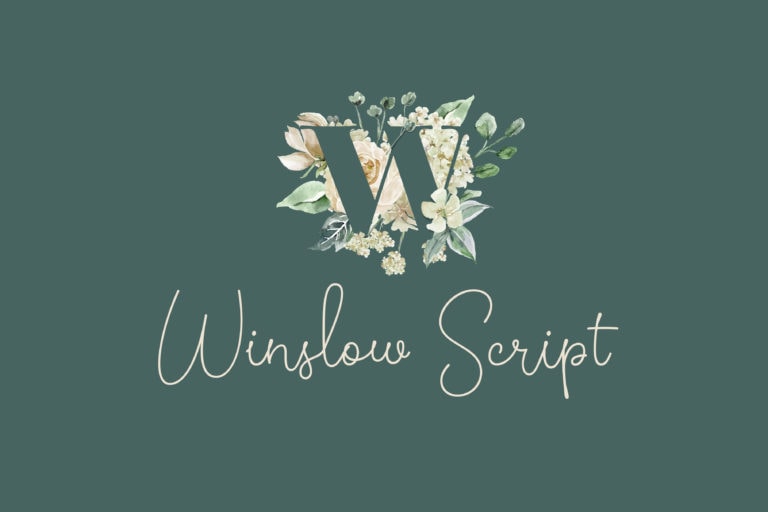
Winslow Script
Styles starting at $25