TYPE TESTER
ABOUT
Refinery is the newest font in the Evanston Collection of square typefaces. With a similar capital structure to Tavern and Alehouse, Refinery includes both lowercase and small caps, making it an ideal typeface for paragraph text settings. It also comes in a wide array of weights and widths, with 85 font files in total.
DESIGN
Refinery has it’s roots in early 20th century signage and saloon typography, but has been modernized – even future-ized – to fit the 21st century digital landscape. The design was aimed at providing a type family that could work in many modern design fields, from sports, tech and military to gaming, HUD, virtual reality and augmented reality.
INSPIRATION
I started working on the Evanston Collection after living in Evanston, IL for two years. I found out that the town was one of the birthplace of the American Prohibition movement. Looking back to signage and typography used in America during the rise of the Temperance movement, I became enamored by the typographic styles of the early 20th century. Saloons, alehouses and eventually moonshine distilleries utilized simple block type painting in various widths and weights across their storefronts. I wanted to emulate this in a way that worked in contemporary text settings.
The journey began with Evanston Alehouse, which features wedge serifs in all capitals with varying weights and widths and display styling options. Once completed, I created Evanston Tavern, a sans-serif version of Alehouse, with additional style features.
ENGINEERING
When designing with the two typefaces, I realized I wished I had a version that focused less on the display optionality and more on readability in paragraphs. I created a lowercase alphabet and re-worked proportions of all the capitals to look better when small. This led to nearly a complete overhaul of most of the characters. The language support was expanded to include Cyrillic and extended Latin. More weights were included to allow users to find the exact font they needed for each design.
Essentially, Refinery is a simple mono-linear square design has been expertly refined into an easy-reading sans serif typeface. It was designed to be used in both display and text settings. From hairline to black in ultra-narrow or extended, the wide array of weight and width options makes it easy to find the right font for each text need.
FEATURES
GLYPHS
LICENSING
Pairings
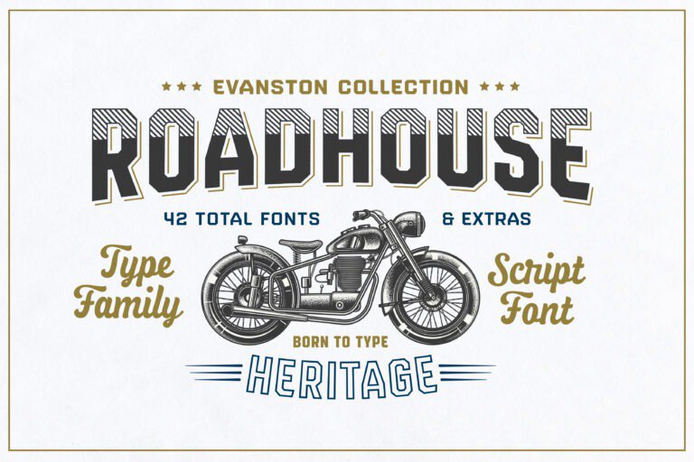
Roadhouse
Styles starting at $10

Evanston Tavern
Styles starting at $10
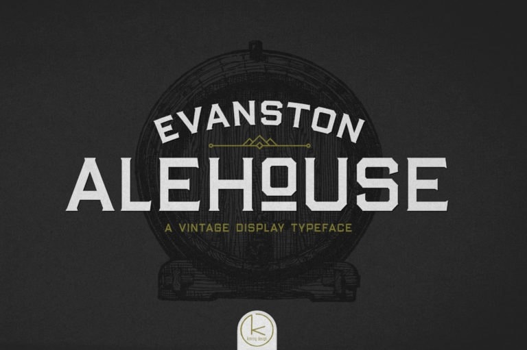
Evanston Alehouse
Styles starting at $10