TYPE TESTER
FEATURES
ABOUT
RESEARCH AND REFERENCES
I actually started Winslow during my Masters program in Typeface Design (MATD) at the University of Reading as part of our main typeface project. I’ve always loved children’s books and how type interacts with illustration, so I decided to create something to be used in shorter text settings, such as children’s books, recipe books, magazines, art books, and the like.
Previous
Next
I spent countless hours at bookstores combing through different genres and finding type styles that caught my eye. I was most intrigued by Scotch Roman and Didone style types, with their high contrast, vertical stress and thin serifs. Though modern fonts are not common book typefaces, I actually found them refreshing alongside imagery and illustrations. I then poured over reference typefaces – both contemporary and historical – to narrow down the specific style I wanted to achieve. Through my research I decided I wanted to strike a delicate balance between a modern style that was elegant and refined and at the same time playful and whimsical.
SKETCHS TO TYPE
When I started sketching the letterforms that would eventually become Winslow, I focused on the details that would give it a unique character. In my intitial sketches I created more traditional bracketed serifs. My characters were quite wide and needed a lot of work in the proportions. I focused on the ball terminals on the a, s and r that would hopefully become a staple of the typeface.
Previous
Next
I wanted to find a balance between readability and playfulness. The text needed to be readable for a long period of time, but I also wanted it to have a sort of dancing effect along the page. At first, my serifs were sharp corners and straight symmetrical brackets. This, however, made the typeface appear quite stern. To keep with my goal of creating a typeface that was both elegant and playful, I decicded that I wanted the serifs to look as though I had created it using a marker (similar to what children draw with). To achieve this effect, I changed the bracketed serifs to rounded corners, created serifs that swelled at the edges. I had to be walk a fine line between sublte and caricaturist, as well as ensuring the font read well when printed in small.
I wanted the top serifs to differ from the bottom, so I experimented with making them slope downward in a curved arch into the rounded cap. This allowed the serifs to be positioned above the x-height without interfering with the height of the round strokes on the ‘n’ ‘m’ ‘r’ etc.
TESTING, TWEAKING AND MORE TESTING
Once the basic form of the typeface was put together, it was time for testing it, making adjustments, retesting, making more adjustments, adding numbers, puncuation, diacritics, doing more testing, tweaking, testing, repeat…repeat…repeat…for 6 months.
This is the longest part of the process, though not the most difficult. I move around the typeface, finding a focus for the day, week or even month, and just go. It’s a fun time in the development becuase you can see the improvements being made, and you just get into a zen with it all. I listen to audiobooks incessently and during this part of the process I can go through a book or two a week.
Coming from a graphic design background, it’s always important for me to create real-life test documents that would allow me to properly examine the typeface in various formats. While I found simple pages of straight text were useful for finding spacing problems and small inconsistencies, I felt that in order to see how the typeface performed I needed to design layouts that simulated how the typeface might actually be used. I scanned in pages of picture books, recipes and art magazines, removed the original text and re-created it with my typeface. This process allowed me to make broad decisions on a family-level. I continued to use these documents to identify necessary changes to different styles and italics. It also helps me see when a typeface is nearly complete!
SPECIMENS, FEATURES AND FINISHING
Throughout the testing process it’s easy to find areas where the typeface could have a slight differences that make it look really cool. In these cases I typically create alternatives. Sometimes they are extensive and sometimes it’s pretty simple and basic. For Winslow, it because clear that having some alternatives for some of the lowercase letters would be beneficial for text settlings geared at children. I took the rightmost serifs and curved them in a sort of swoop. The effect was charming and one of my favorite details about the typeface. Another stylistic altnerative I made adding ball terminals to the R and K diagonal stems. It’s adds a little character to the capital set and is great for titling.
I also created specialized ligatures, in particular for the capital R and A connection. I included a set of small capitals (since it is a book typeface after all) and included a set of lifted small capitals as an additional titling style. Lastly was a simple set of swashes on the leftside serifs of capital characters, just in case anyone wanted a little extra flair.
Too see the full list of extras, check out the FEATURES section!
Winslow was a lot of fun to make and a new challenge for me. My work has predominantly focused on display fonts, and this was my first foray into paragraph text types, which requires a completely different way of thinking. Display typefaces are meant to be viewed on a larger scale and thus can include much more detail, distortion, or texture. With display typefaces, maintaining legibility is vital. Text typefaces, however, are designed to be small in size and more focused on readability (the ease with which a reader can understand text without causing strain to the eyes and brain). Essentially, display fonts are designed to be noticed, and text fonts are designed to be invisible. Understandably, they require completely different approaches.
I am very proud of this typeface and am working on expanding it with a display, monoline and handdrawn versions. I hope you enjoy it!
RESEARCH AND REFERENCES
I actually started Winslow during my Masters program in Typeface Design (MATD) at the University of Reading as part of our main typeface project. I’ve always loved children’s books and how type interacts with illustration, so I decided to create something to be used in shorter text settings, such as children’s books, recipe books, magazines, art books, and the like.
I spent countless hours at bookstores combing through different genres and finding type styles that caught my eye. I was most intrigued by Scotch Roman and Didone style types, with their high contrast, vertical stress and thin serifs. Though modern fonts are not common book typefaces, I actually found them refreshing alongside imagery and illustrations. I then poured over reference typefaces – both contemporary and historical – to narrow down the specific style I wanted to achieve. Through my research I decided I wanted to strike a delicate balance between a modern style that was elegant and refined and at the same time playful and whimsical.


SKETCHES TO TYPE
When I started sketching the letterforms that would eventually become Winslow, I focused on the details that would give it a unique character. In my intitial sketches I created more traditional bracketed serifs. My characters were quite wide and needed a lot of work in the proportions. I focused on the ball terminals on the a, s and r that would hopefully become a staple of the typeface.
I wanted to find a balance between readability and playfulness. The text needed to be readable for a long period of time, but I also wanted it to have a sort of dancing effect along the page. At first, my serifs were sharp corners and straight symmetrical brackets. This, however, made the typeface appear quite stern. To keep with my goal of creating a typeface that was both elegant and playful, I decided that I wanted the serifs to look as though I had created it using a marker (similar to what children draw with). To achieve this effect, I changed the bracketed serifs to rounded corners, created serifs that swelled at the edges. I had to be walk a fine line between subtle and caricaturist, as well as ensuring the font read well when printed in small.


I wanted the top serifs to differ from the bottom, so I experimented with making them slope downward in a curved arch into the rounded cap. This allowed the serifs to be positioned above the x-height without interfering with the height of the round strokes on the ‘n’ ‘m’ ‘r’ etc.


TESTING, TWEAKING AND MORE TESTING
Once the basic form of the typeface was put together, it was time for testing it, making adjustments, retesting, making more adjustments, adding numbers, puncuation, diacritics, doing more testing, tweaking, testing, repeat…repeat…repeat…for 6 months.
This is the longest part of the process, though not the most difficult. I move around the typeface, finding a focus for the day, week or even month, and just go. It’s a fun time in the development becuase you can see the improvements being made, and you just get into a zen with it all. I listen to audiobooks incessently and during this part of the process I can go through a book or two a week.
Coming from a graphic design background, it’s always important for me to create real-life test documents that would allow me to properly examine the typeface in various formats. While I found simple pages of straight text were useful for finding spacing problems and small inconsistencies, I felt that in order to see how the typeface performed I needed to design layouts that simulated how the typeface might actually be used. I scanned in pages of picture books, recipes and art magazines, removed the original text and re-created it with my typeface. This process allowed me to make broad decisions on a family-level. I continued to use these documents to identify necessary changes to different styles and italics. It also helps me see when a typeface is nearly complete!

SPECIMENS, FEATURES AND FINISHING
Throughout the testing process it’s easy to find areas where the typeface could have a slight differences that make it look really cool. In these cases I typically create alternatives. Sometimes they are extensive and sometimes it’s pretty simple and basic. For Winslow, it because clear that having some alternatives for some of the lowercase letters would be beneficial for text settlings geared at children. I took the rightmost serifs and curved them in a sort of swoop. The effect was charming and one of my favorite details about the typeface. Another stylistic altnerative I made adding ball terminals to the R and K diagonal stems. It’s adds a little character to the capital set and is great for titling.
I also created specialized ligatures, in particular for the capital R and A connection. I included a set of small capitals (since it is a book typeface after all) and included a set of lifted small capitals as an additional titling style. Lastly was a simple set of swashes on the leftside serifs of capital characters, just in case anyone wanted a little extra flair.
Too see the full list of extras, check out the FEATURES section!
Winslow was a lot of fun to make and a new challenge for me. My work has predominantly focused on display fonts, and this was my first foray into paragraph text types, which requires a completely different way of thinking. Display typefaces are meant to be viewed on a larger scale and thus can include much more detail, distortion, or texture. With display typefaces, maintaining legibility is vital. Text typefaces, however, are designed to be small in size and more focused on readability (the ease with which a reader can understand text without causing strain to the eyes and brain). Essentially, display fonts are designed to be noticed, and text fonts are designed to be invisible. Understandably, they require completely different approaches.
I am very proud of this typeface and am working on expanding it with a display, monoline and handdrawn versions. I hope you enjoy it!
GLYPHS
LICENSING
Pairings
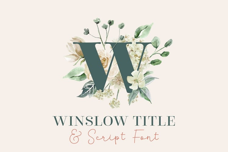
Winslow Title
Styles starting at $25
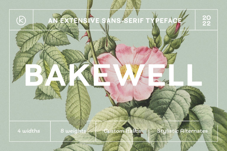
Bakewell
Styles starting at $10
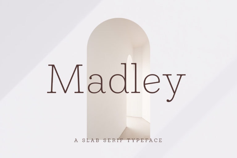
Madley
Styles starting at $10