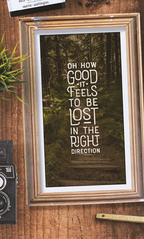
I was inspired to create the Rainier type family during my summer back home in the Pacific Northwest. The concept behind it may be simple – a hand crafted font family – but what it delivers is quite complex! Here is a breakdown of everything you get:
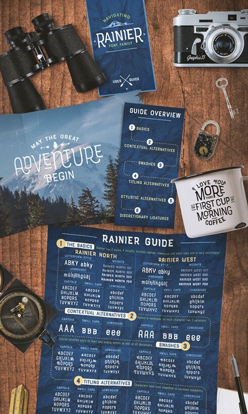
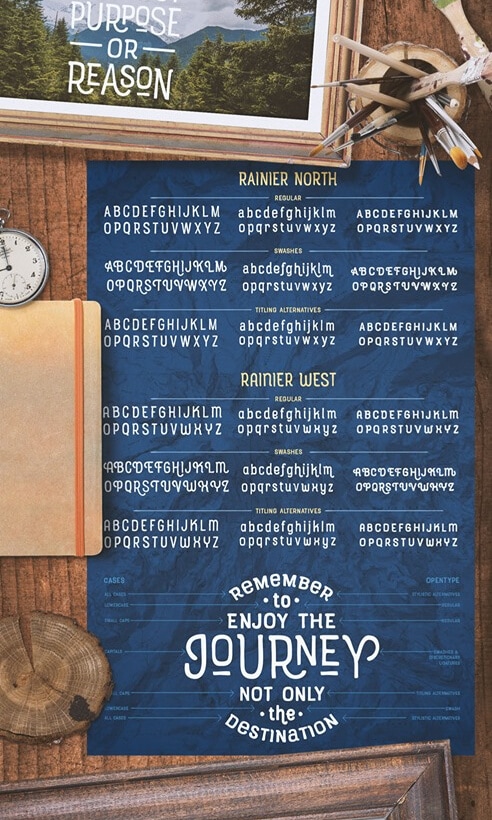
FONT FAMILIES: Two sub-families with unique styles – Rainier North and Rainier West
WEIGHTS: 4 weights per family, broken down numerically – 100 (light), 300 (regular), 500 (bold), 700 (black)
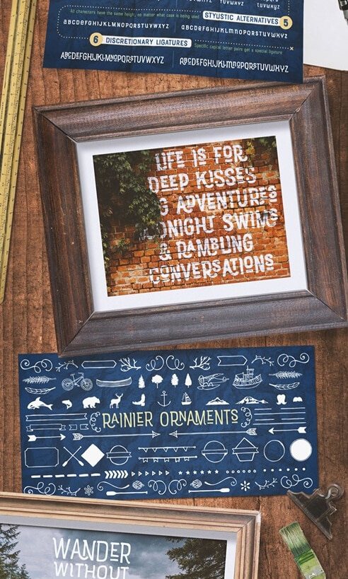
OPENTYPE: In each family, there are tons of OpenType options, offering lots of customizable opportunities (in order to access all these goodies, you must be using Illustrator, Photoshop, Indesign or Publisher). Because Rainier is 100% handmade, contextual alternatives allow each letter has three subtle variations, this way it keeps that authentic hand-drawn look. Additionally, a full alphabet with special descending swashes, as well as start and end swashes for capitals and small caps. Titling alternatives offer a full character set just to help with readability! Meant for captions or smaller text, these letterforms are easy on the eye and a great complement to the regular alphabet. Stylistic Alternatives add a little fun, providing a unified cap height, no matter what case you are using (all caps, small caps or lowercase.) Discretionary Ligatures are created only for capitals, and takes specific letter pairs and creates a unique ligature between them
ORNAMENTS: In addition to the font, you get a set of awesomely rustic ornaments designed and drawn to go specifically with Rainier! – Rustic Northwest Illustrations – Banners & Flags – Frames – Flourishes – Lines & Line Breaks – Arrows