TYPE TESTER
FEATURES
ABOUT
OVERVIEW
Roadhouse is a layering typeface family that is part of the greater Evanston Type Collection, which is inspired by American typefaces commonly used at the turn of the century leading up to Prohibition. Roadhouse reflects the style of lettering used on tavern signage and printed ephemera during the early 20th century.
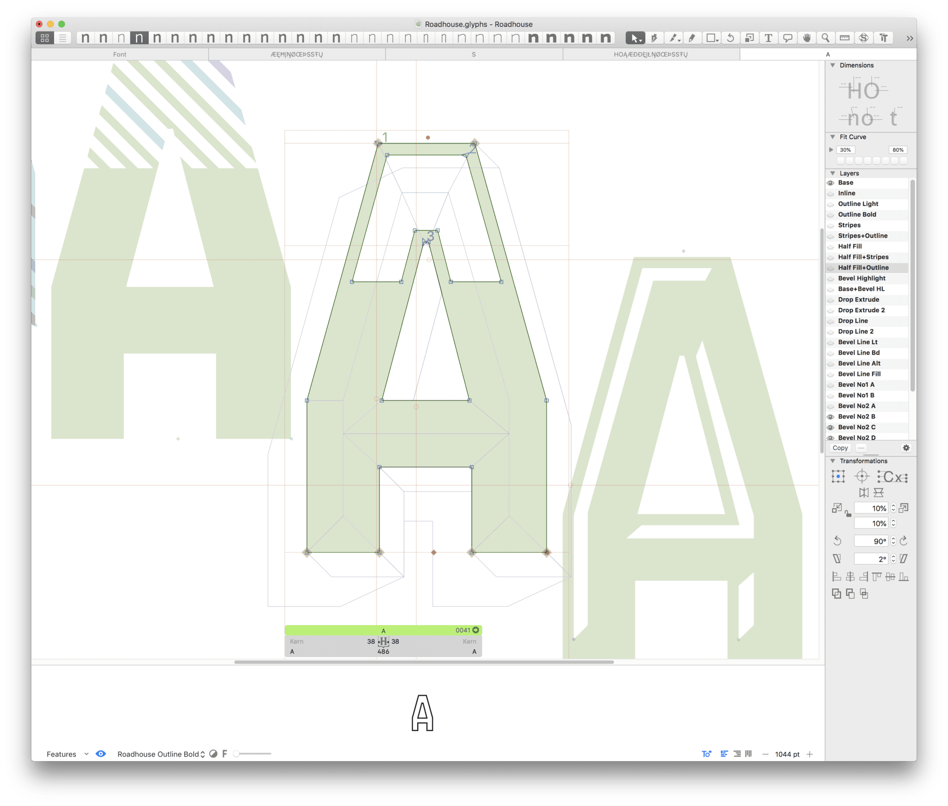
The family comes with 31 layering fonts, from top layers like bevels, highlights, stripes, outlines, as well as extruding and drop layers. It also includes 2 script fonts, upright and oblique, as well as 9 complimentary text fonts for smaller text settings.
Either get the entire family of extrusions, bevel angles or the basic family with ready to use fonts that don’t need to be layered. Roadhouse is a great display typeface for logos, branding, packaging, and advertising.
BACKGROUND
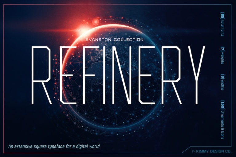
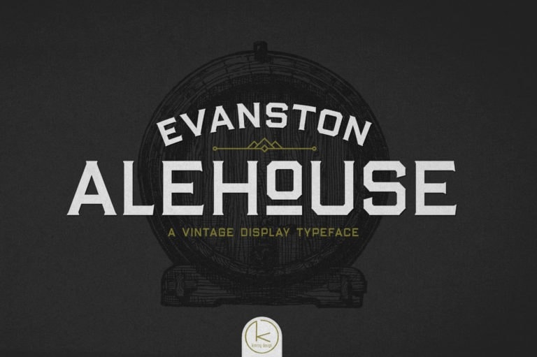
I’d been working on the Evanston Collection off and on for several year, ever since living in Evanston, IL just north of Chicago and getting deep into the American Prohibition. I loved the square lettering seen on Taverns, Saloons and Main Street shops and wanted to modernize them to work in more contemporary display settings. I had originally envisioned a large family collection of square fonts that all worked with each other, beginning with the wedge serifed Alehouse and san-serif Tavern. I actually like Tavern so much that I wanted to try a broader family that included lowercase, small caps, and was intended more for text settings. This became Refinery, which took on more of a futuristic aesthetic.
BUILDING THE FAMILY
To finish up the collection I decided to create a layering font family. This was became Roadhouse, and really embodied more of the lettering styles that would have been utilized at the turn of the 20th century. Engraving techniques led to various bevel font variants, outlines, extrusions, drop shadows were all added in turn to create the basic structure of the typeface.
Layering fonts are great when used on top of each other, but don’t often make for great secondary or tertiary text. Even though a customer could just purchase one of the Refinery fonts as a complimentary type, it would be a much smoother user experience to have it all wrapped up in one family. So I added secondary fonts of varying widths and weights to accompany the layering set.
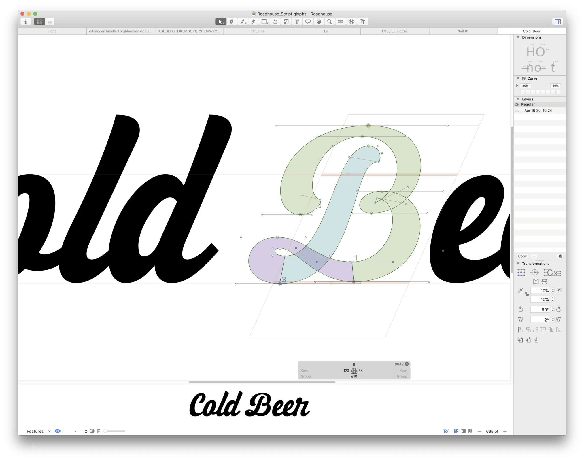
While the collection was working great together, I still felt as though it was missing something. So I added a vintage brush script lettering font as another piece to the family. It added a more delicate touch to the very mechanical letterforms of the square font.
Together, the family is an extensive bundle of layering, script and text fonts that work cohesively together.
